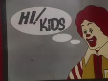
 This vintage portrait of R McD at McDs in Camberwell shows evidence of a problem a lot of us have often to deal with. If you can’t guess it from the picture then you are part of the problem yourself. Hell! No, it’s not the exclamation mark in the middle of the phrase, although I admit that’s weird (and no, it’s not any permutation of that old clown/paedophile saw). Look at it!
In the old days half way between computerised design and whatever they called the older form of design for publication – was it analogue? – I used to have the same impotent rages at the designers at Smash Hits. We liked the idea of big (say – 1/3 of a page) images of people, with them saying something (‘Hi popsters it's me, Collette and my shoes are too big! My new single is called All i wanna do is dance! Oops! Toodles!’) via a talks balloon. But no-one except me seemed to appreciate that the talks balloon had a, I don’t know what the word is for it, a pointer, a branch, a stick, you know, it comes out of the bottom of the balloon and points towards the mouth. That was the idea – it points towards the mouth. To show the person is talking out of their mouth. These people would be sticking the pointers into the person’s eyes, into their ears, into their necks, whatever - denoting to me that eyes, ears, something they swallowed, is talking. They were removed from the actual reason for the talks balloon and what it denoted. They thought (like so many of my students do these days when they’re writing sentences) that if you just bump things together that’s completely good enough and the fact that they coexist in proximity show that there is a relationship and to hell with anyone who asks what that relationship actually IS (and what’s a comma anyway?).
Anyway what are you and I going to do, the people who want things to be done properly and decently all for the sake of clarity and sense. We are fighting a losing battle mate, fighting a losing fucken battle. Some of us are not even really fighting I suppose truth be told.


1 comment:
The mistreatment of speech bubbles by McDonalds has a long, cruel history.
Post a Comment